
The Magic of Textiles: How to Use Fabrics to Elevate Your Interior Design
**Textiles are the quiet powerhouses of interior design.** They soften hard lines, draw the eye, and transform the way a room feels and functions—often without changing a single piece of furniture. A well-chosen fabric can make a modest sofa look custom, and can funnel a palette into a story that feels coherent and intentional. The magic lies in how **fabrics carry color, absorb and reflect light, and add tactility** that you can both see and feel.
Whether you’re layering rugs for depth, mixing patterns for charisma, or choosing a performance fabric that stands up to real life, your textile choices are the most agile tools in the design toolkit. Therefore, knowing how to **use fabrics to elevate your interior design** is essential.
You can refresh a room in an afternoon with new pillow covers, completely shift acoustic comfort with heavy drapery, or pivot the mood seasonally with a swap of throws. Here’s how to harness that magic—confidently, creatively, and in a way that fits your life.
—
Section 1: The Foundation – Understanding Textile Types and Performance

1. Choose Fibers for Function and Grace
Natural fibers are the starting point for many design stories because they age gracefully and bring organic character. **For example,** Cotton is versatile and breathable, while Linen offers beautiful slub and drape. Wool insulates and resists wrinkling, and Silk delivers an unmatched glow.
Synthetics (polyester, acrylic, nylon) deliver durability, fade resistance, and budget-friendliness. Blends offer the best of both worlds: the look and feel of naturals with the performance of man-made fibers. This forms the basis of sophisticated **textiles interior design**.
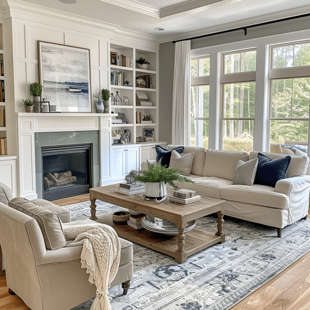
2. Layer Textures and Weaves for Depth
Texture is where fabrics start to “speak.” Consider the difference between the crisp snap of percale and the buttery lay of sateen; the hearty tooth of canvas versus the smooth nap of velvet. Texture is a tool for balancing a room’s visual weight: add chunky knits or bouclé to warm up sleek spaces, or integrate tight weaves and fine wools to refine a rustic envelope.
**Remember the Weaves:** Plain weaves (Linen) are crisp; Twill weaves (Denim) bring diagonal movement; Sateen delivers sheen; and Pile fabrics (Velvet) play with light and touch. Varying textures is key to successful **textiles interior design**.
3. Prioritize Performance, Not Just Looks
Performance and practicality matter as much as beauty. Look at **rub counts** (Wyzenbeek or Martindale) for upholstery durability, and ask about stain resistance, colorfastness, and cleaning codes. **For window treatments,** linings are unsung heroes: blackout lining controls light and heat, and interlining adds body and insulation.
In high-sun rooms, solution-dyed acrylics and outdoor-rated textiles prevent fading and mildew. Sustainability is also accessible: seek recycled polyester and fabrics with low-impact dyes. This allows you to **use fabrics to elevate your interior design** for the long term.
—
Section 2: Styling – Color, Pattern, and Layering (Tricks 4-6)

4. Build Your Palette Around an Anchor
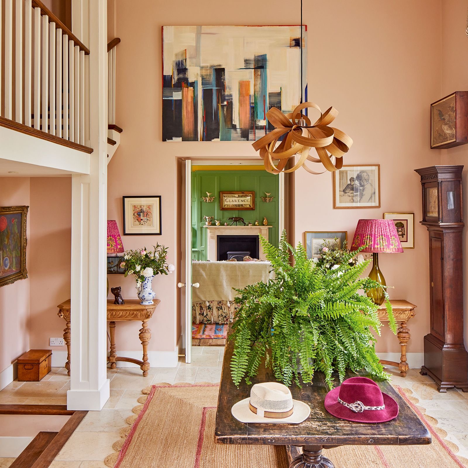
Color is the quickest lever for mood. Start by identifying your anchor: a rug, artwork, or existing sofa that you love. Pull a **three- to five-color palette** from that anchor, paying attention to undertones.
Warm palettes (terracotta, olive) pair well with nubby linens; cool palettes (slate, teal) shine with velvets and tighter weaves. **To keep things cohesive,** repeat each color at least three times across textiles of different scales and textures. Use color temperature to tune perception: cooler drapery lightens sun-drenched rooms; warmer throws cozy up north-facing spaces.
5. Master the Pattern Mixing Formula
Pattern mixing is where personality emerges. The simplest formula is a **trio with varied scale**: one large-scale pattern (a bold ikat), one medium (a stripe or geometric), and one small (a tight herringbone). Keep a common thread—shared color, line quality, or motif family—to prevent chaos.
If your rug is busy and large-scale, calm the sofa with a textured solid and bring pattern back in with pillows and a throw. **Stripes and checks are pattern peacemakers**; they pair with almost anything and add structure. This sophisticated use of **textiles interior design** elevates the space.
6. Layer with Intention and Rhythm
Layering is the textile equivalent of styling, and it can reframe a room in minutes. Begin with a foundational rug to define the zone. Add your largest planes—sofa upholstery, curtains—keeping these calmer and more textural. Then edit in mid-scale elements: a tailored throw, a bench cushion.
Finish with small accents—pillow stacks that mix textures and trims. **Think in seasons:** lighter weaves for spring/summer; mohair throws, velvet pillows, and heavier drapes for fall/winter. Use trims—piping, fringe—to outline shapes and elevate simple solids. The goal is rhythm and repetition, allowing you to **use fabrics to elevate your interior design** seamlessly.
—
Conclusion: Design Not Just How It Looks, But How It Feels
Textiles make spaces humane. They soften acoustics, temper light, warm surfaces, and infuse color and character in ways that hard finishes can’t. With a basic grasp of fiber types, weaves, and performance—and a playful approach to color, pattern, and layering—you can recalibrate a room’s mood and function without a renovation.
Most importantly, treat fabrics as living parts of your home. Swap them with the seasons, repair and refresh instead of replacing, and choose pieces that tell your story. That’s the magic of textiles: they let you design not just how a room looks, but how it feels to be there.
What’s the biggest challenge you face when working with textiles—pattern mixing or durability?

3 thoughts on “The Magic of Textiles: How to Use Fabrics to Elevate Your Interior Design”