The 5 Paint Colors Designers Are Choosing Instead
In the ever-evolving world of interior design, color trends come and go, but some choices resonate more deeply with designers looking to strike the perfect balance between style, mood, and longevity. Recently, many interior design professionals have been moving away from traditional neutral tones and overpowering bolds, opting instead for a curated palette that offers sophistication, versatility, and a fresh approach to modern living spaces. If you’re thinking about updating your walls, here are the five paint colors designers are choosing instead—and why they’re making such an impact.
—
Why Designers Are Rethinking Traditional Color Choices
Traditionally, shades like pure white, beige, and gray have dominated interior walls due to their timeless nature and flexibility. However, a saturation of these colors in the market has led to a search for alternatives that feel just as neutral but bring more warmth, personality, and depth to spaces. This shift aligns with larger trends in interior design focused on comfort, nature-inspired aesthetics, and subtle richness.
The versatile paints on this list are excellent for various environments—from cozy living rooms and serene bedrooms to dynamic kitchens and workspaces. They perfectly complement the diverse textures, materials, and lighting scenarios that contemporary interiors demand.
—
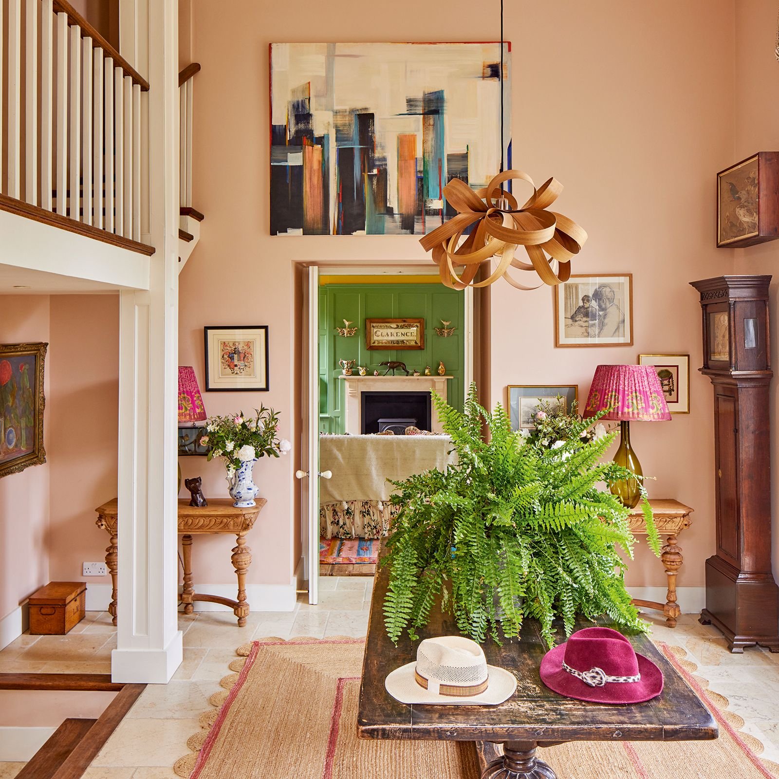
1. Soft Sage Green
Soft sage green has surged as a favorite because it effortlessly blends the calming qualities of green with the neutral intent of traditional paint hues. This muted tone evokes tranquility and a connection to the outdoors, which is especially appealing in urban settings where access to nature can be limited.
Interior design experts praise sage green for its ability to work beautifully with wooden accents, rattan furniture, and plenty of plants, creating spaces that feel both fresh and grounded. It’s an excellent alternative for those who want a color with life but without overwhelming vibrancy.
—
2. Warm Greige
The marriage of gray and beige, known as “greige,” has been a subtle favorite for a while. But recently, designers have leaned toward greiges with warmer undertones, which add a gentle warmth that pure gray often lacks. This nuance helps rooms feel cozier, making it especially popular for bedrooms and living areas.
Warm greige pairs well with both modern and traditional furnishings, making it a versatile base color. It also complements gold and bronze accents, adding a touch of luxury without feeling opulent.
—
3. Dusty Blue
Dusty blue exudes a sophisticated calmness that fits perfectly in spaces designed for relaxation and focus. As an alternative to stark whites or heavy grays, this color adds personality while maintaining a serene atmosphere.
Interior designers often recommend dusty blue for bathrooms, offices, and bedrooms, where a sense of calm is prioritized. It also looks stunning against natural wood paneling or crisp white trims, helping to create a layered, visually appealing interior.
—
4. Muted Terracotta
Going beyond the typical reds and browns, muted terracotta introduces earthiness with a muted saturation that’s neither too bold nor too dull. This color recalls the rustic warmth of sun-baked earth and terracotta pots, bringing a subtle connection to global and artisanal design movements.
Design experts find this color especially useful in accent walls or as an overarching theme in rooms that incorporate woven textiles and ceramics. Muted terracotta pairs beautifully with cream, off-white, and even navy blue for a rich, layered look.
—
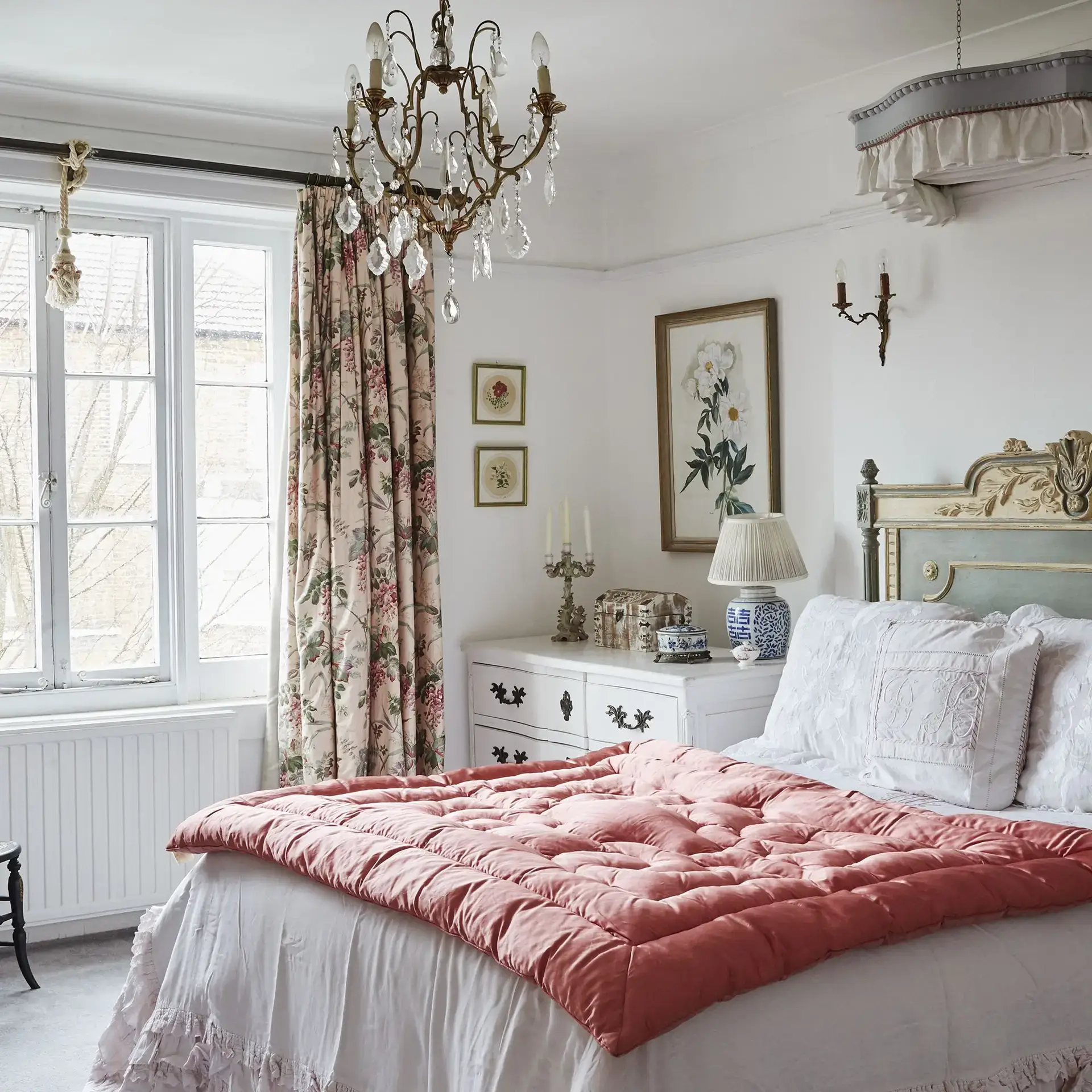
5. Soft Mauve
Soft mauve is a gentle, understated take on purple that adds unexpected elegance without being overpowering. Designers appreciate its unique ability to introduce color with softness, offering a romantic and luxurious vibe ideal for bedrooms and intimate spaces.
This shade works well when paired with grays and white, but it also complements brass or matte black fixtures, adding to the growing trend of mixing traditional and modern elements in interior design.
—
How These Colors Reflect Current Interior Design Trends
The popularity of these five paint colors highlights a broader movement in interior design toward naturalism, warmth, and subtle personality. Many designers are focusing on creating spaces that feel lived-in, comfortable, and connected to nature, rejecting sterile minimalism or overly trendy maximalism.
These colors also reflect an appreciation for versatility. They create a backdrop that allows furniture, art, and accessories to shine without competing for attention. Plus, they adapt well to different lighting conditions, making them suitable for a wide range of homes and tastes.
—
Final Thoughts
If you’re planning to update your space and considering a color refresh, exploring the paint hues designers are gravitating toward can serve as invaluable inspiration. Moving away from generic neutrals and harsh whites opens up a world of subtlety and character, allowing your interior to reflect both current design sensibilities and timeless comfort.
Choosing soft sage, warm greige, dusty blue, muted terracotta, or soft mauve can transform your home into a stylish sanctuary that balances modern trends with personal warmth. In the realm of interior design, these colors are proving that the right paint choice is about mood, composition, and the feeling it evokes as much as it is about mere aesthetics.
2 thoughts on “Interior Design: 5 Stunning Paint Colors You Must Choose Now”