home decor is entering a vibrant new era, one where color has charisma again. After years of playing it safe with greige—those comforting blends of beige and gray—people are craving rooms that feel alive, personal, and memorable. Bold color doesn’t have to mean chaotic or high-maintenance. With a little guidance, you can layer confident hues in a way that feels effortless, cohesive, and truly you.
—
Why Neutrals Took Over—and Why We’re Craving Color

Neutrals surged because they’re easy to coordinate, make spaces feel bigger, and photograph beautifully. Greige, in particular, became the default because it straddles warm and cool tones, providing a flexible backdrop for fluctuating trends. But neutral fatigue is real. When every room looks like a real estate listing, it can be hard to express personality. Color answers that craving by adding dimension, warmth, and a sense of story. A saturated blue can calm; a jubilant coral can spark energy; a rich green can connect your space to nature. Bold color isn’t just aesthetic—it’s emotional.
—
How Bold Color Transforms home decor
Color works on multiple levels in home decor:
- Mood: Blues and greens soothe; reds and oranges energize; yellows uplift; purples add luxury and drama.
- Architecture: Darker trims can highlight moldings; color-blocked walls can “correct” odd room proportions; painted ceilings can create intimacy or height.
- Flow: A repeated accent color can tie open-plan spaces together; varied saturation can move the eye from room to room gracefully.
- Texture and material: Color draws attention to natural wood grains, metals, stone textures, and textiles you love.
The magic is in the balance. You can keep what you loved about greige—calmness and cohesion—while inviting richer hues to do the storytelling.
—
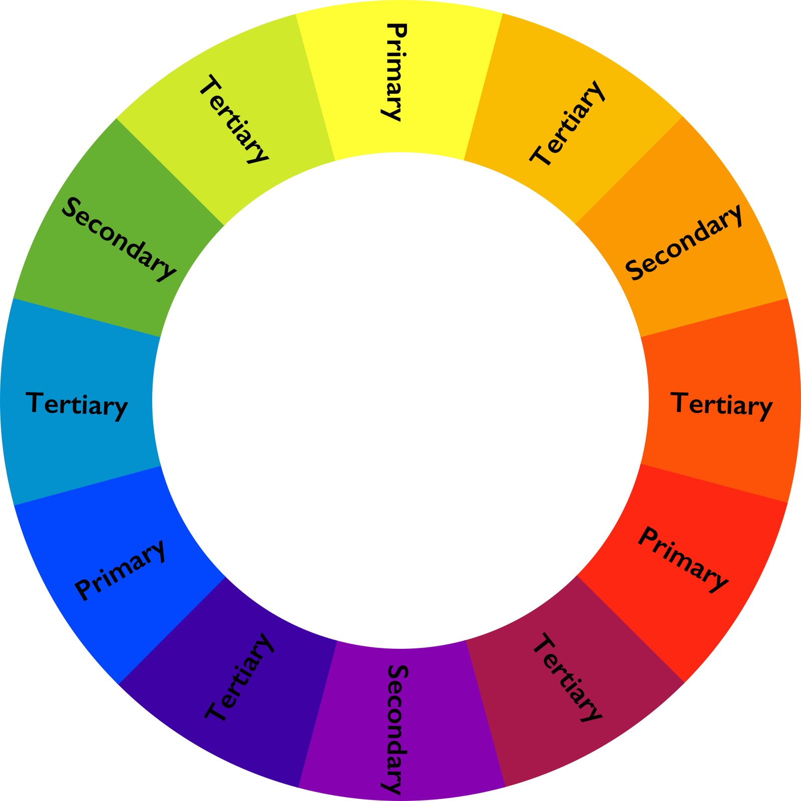
Color Theory, Simplified for Real Rooms

You don’t need an art degree to get color right. Start with these practical ideas:
- **Undertones rule.** Even neutrals have undertones (pink, green, blue, yellow). Identify them by holding a true white paper next to your paint or fabric. Match undertones across a room to prevent clashes.
- **Temperature matters.** Warm colors (reds, oranges, warm yellows) feel cozy and inviting; cool colors (blues, greens, cool purples) feel serene and expansive. Mix both for a lively yet grounded space.
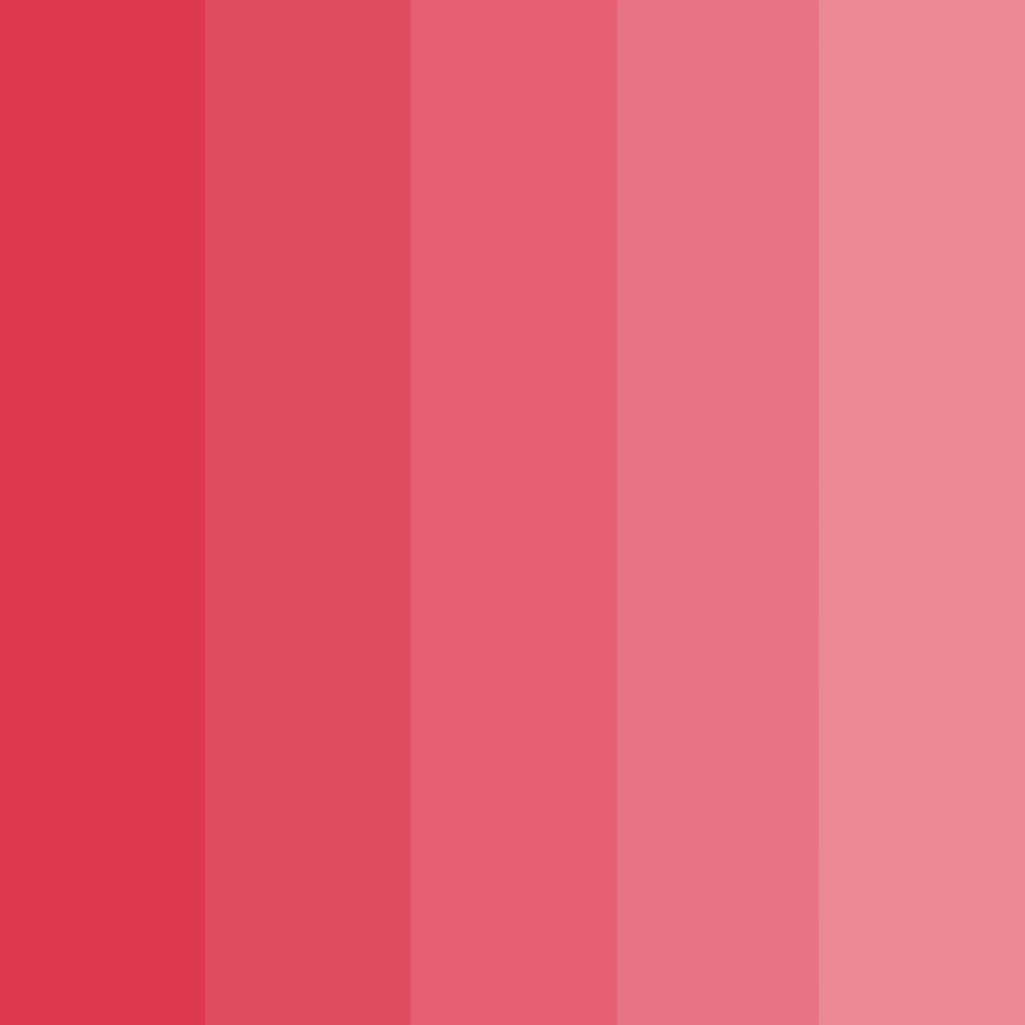
- **Saturation is your friend.** Two colors can share a hue but differ in intensity. Pair a saturated jewel tone with a softened version of a complementary shade to avoid visual shouting.
- **Contrast creates interest.** High-contrast pairings (navy with crisp white) add drama; low-contrast pairings (olive with khaki) feel refined and layered.
—
Choosing Your Palette: From Inspiration to Plan

Borrow from sources that already harmonize:
- Nature: Think moss green, cinnabar clay, sunflower gold, and river blue.
- Fashion: Your favorite scarf or sneaker may already reflect your personal color DNA.
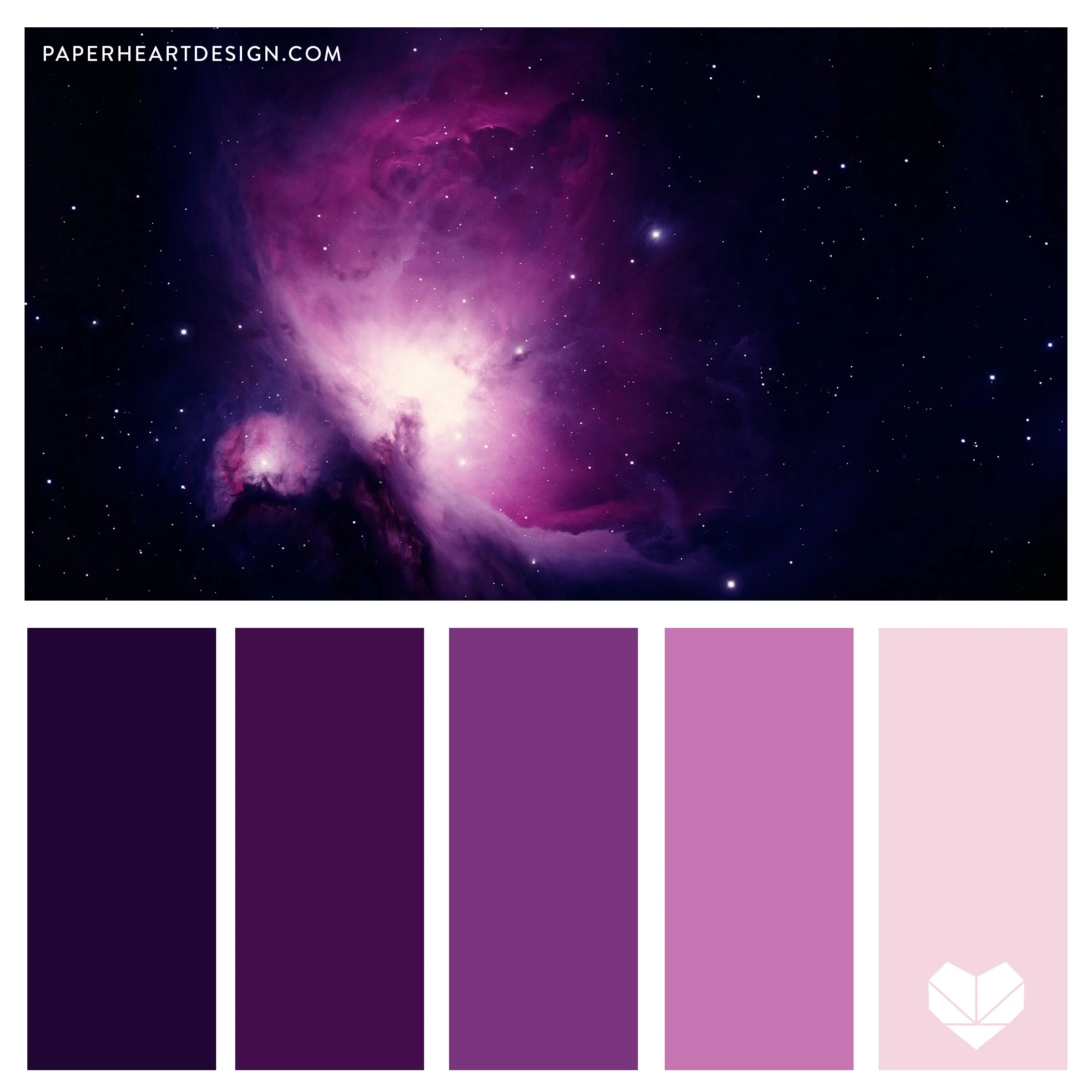
- Artwork and rugs: Use a multicolor piece as a “palette blueprint.” Pick one dominant hue, one supporting hue, and one accent.
- Travel photos: Pull colors from a market scene in Marrakech, a Tuscan landscape, or a coastal town.
[hostinger-affiliate-table id=”776″]
Then, build your palette:
- **Set your anchor.** Decide on a dominant hue for the largest surfaces (walls, or a hero sofa/rug).
- **Choose a temperature partner.** If your anchor is cool (teal), bring in a warm complement (terracotta).
- **Add a neutral.** Keep a grounding neutral (bone, camel, charcoal) in your mix—it stabilizes bolder choices.
- **Decide your distribution.** Think **60-30-10**: 60% dominant, 30% support, 10% accents. It’s a guide, not a rule.
Test before committing:
- Paint swatches on multiple walls and look at them morning, afternoon, and night.
- Move fabrics around the room to see how they interact with your light and existing finishes.
- If you’re nervous, start with a powder room, hallway, or entry—small spaces are perfect color laboratories.
—
Room-by-Room Ideas for Chromatic Confidence
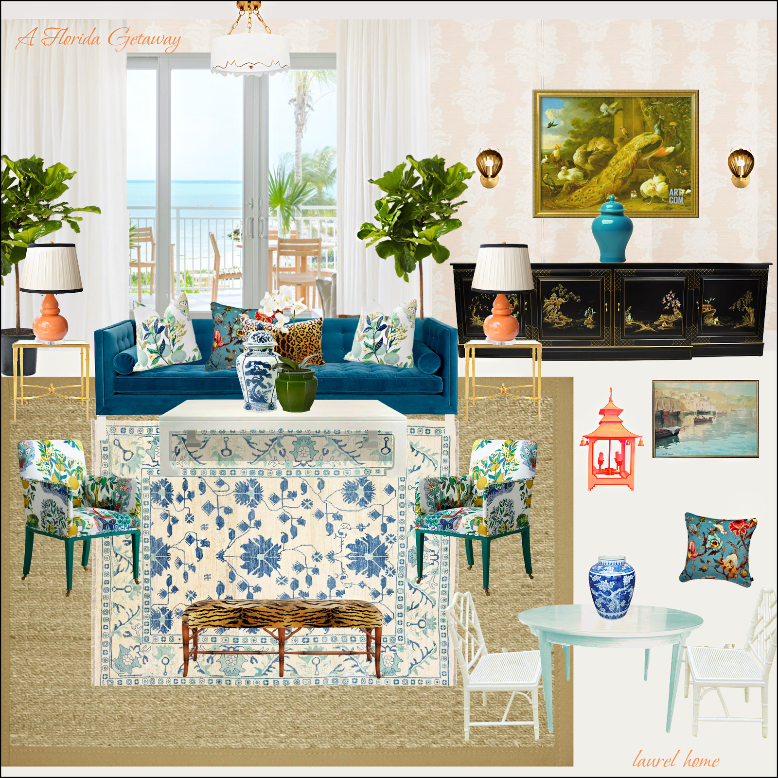
- Living room: Try a deep teal on built-ins, a velvety rust throw, and a patterned rug that ties them together. Keep the sofa neutral but textured (bouclé, linen, or chenille) to balance intensity.
- Kitchen: Color the lower cabinets in forest green or midnight blue, keep uppers light, and add brass or matte black hardware. Consider a colorful Zellige backsplash to bring artisanal warmth.
- Dining area: Saturated walls—olive, plum, or inky blue—set a moody backdrop for candlelight. Upholster chairs in durable, wipeable fabrics with a pop of color or pattern.
- Bedroom: Wrap the room in a soothing hue—smoky eucalyptus or soft aubergine. Paint doors and trim a notch darker for depth, and layer natural linen, wool, and a patterned quilt.
- Bathroom: Go jewel-box bold. Emerald tile, deep navy vanity, or a cinnamon-hued ceiling paired with warm metallic fixtures. The small footprint rewards strong choices.
- Entry: Make an entrance with paprika on the door, a patterned runner, and a gallery wall that introduces your home’s palette at first step.
—
Rental- and Budget-Friendly Color Upgrades

You don’t need full-scale renovations to harness color:
- **Removable wallpaper**: Accent a niche, bookcase back, or an entire powder room.
- **Textiles**: Swap pillow covers seasonally; add a color-forward throw, curtains, or bedspread.
- **Lighting**: Lampshades in pleated patterns or colored glass add glow and hue simultaneously.
- **Artwork**: Frame bold prints with oversized mats for gallery impact.
- **Painted furniture**: A vintage dresser in saffron or a console in petrol blue becomes a statement.
- **Accent doors and trim**: A single door painted persimmon or blackberry can transform a hallway.
—
Materials, Finishes, and Pattern Mixing
- Paint sheen: Use matte/eggshell for walls (hides imperfections); satin/semi-gloss for trim and doors (wipeable, light-bouncing); flat or matte for ceilings.
- Wood tones: Mid to dark woods pair beautifully with saturated colors; keep undertones aligned (cool walnut with cool blues, warm oak with warm reds/oranges).
- Metals: Brass and bronze warm up deep blues and greens; chrome and nickel sharpen cool palettes; black adds graphic contrast to nearly everything.
- Pattern scale: Mix one large-scale pattern (rug or wallpaper), one medium (throw or curtains), and one small (pillow or trim). Keep a common color thread for cohesion.
- Texture trio: Aim for three textures minimum—smooth (ceramic/glass), nubby (bouclé/wool), and natural (rattan/wood)—to make bold color feel rich, not loud.
—
Lighting, Undertones, and Visual Flow

Lighting changes color dramatically:
- Northern light is cool and soft—warm your palette with earthy tones or warm whites.
- Southern light is warm and intense—cool colors can balance heat and glare.
- East-facing rooms glow in the morning—choose colors you love in warm light.
- West-facing rooms are golden at dusk—watch for colors that shift undesirably in evening light.
Create flow by repeating a color family across spaces at varying saturations. For example, a deep indigo in the living room, softened to denim in the hallway runner, and distilled to pale sky in a bedroom throw. Your eye reads the connection intuitively.
—
Common Mistakes and How to Avoid Them

- Going bold without a plan: Choose an anchor and a distribution strategy so the room doesn’t feel piecemeal.
- Ignoring undertones: A cool gray sofa with a warm beige rug can read “off.” Use a sample board to test combinations.
- Overloading accents: Ten small pops of different colors create visual noise. Aim for a few deliberate, repeated accents.
- Forgetting the ceiling and trim: They’re powerful color tools. A colored ceiling can cozy up tall rooms; painted trim can add architecture where there is none.
- Skipping samples: Always test paint and fabric in your actual light. Screens lie; swatches tell the truth.
—
Five Ready-to-Use Palettes
1) Modern Mediterranean
- Colors: Terracotta, cobalt, olive, soft limestone
- Where to use: Terracotta walls or rug, cobalt ceramics or door, olive textiles, limestone-toned upholstery
- Metals/woods: Aged brass, walnut
- Mood: Sunny, artisanal, grounded
2) Urban Jewel Box
- Colors: Aubergine, peacock blue, rose quartz, charcoal
- Where to use: Peacock built-ins, aubergine dining walls, rose pillows/art, charcoal sofa
- Metals/woods: Blackened steel, ebonized oak
- Mood: Dramatic, intimate, sophisticated
3) Forest Retreat
- Colors: Moss, inky navy, wheat, bone
- Where to use: Moss cabinetry or headboard, navy accents, wheat drapery, bone walls or trim
- Metals/woods: Brushed nickel, white oak
- Mood: Calm, organic, timeless
4) Coastal Not-So-Classic
- Colors: Sea glass green, clay, sand, indigo stripe
- Where to use: Sea glass walls, clay planter and linen throw, sand upholstery, indigo striped rug
- Metals/woods: Polished nickel, driftwood finishes
- Mood: Airy, fresh, relaxed
5) Spiced Modern
- Colors: Paprika, saffron, deep teal, mushroom
- Where to use: Paprika door or accent wall, saffron velvet pillow, teal media console, mushroom walls
- Metals/woods: Warm brass, mid-tone oak
- Mood: Energetic, eclectic, cozy
—
Color Confidence in home decor: A Step-by-Step Start
If you want a simple action plan, try this:
- **Audit what you own.** Note the dominant undertones of your big pieces and finishes (flooring, countertops).
- **Pick one bold hue you love deeply.** This is your north star.
- **Create a three-swatch test.** Choose your bold hue, a harmonious partner, and a grounding neutral. Test on walls or make a mood board with real samples.
- **Commit small.** Paint a door, powder room, or bookcase. Evaluate how the color changes your mood and how it behaves with light throughout the day.
- **Layer textiles next.** Add two items in your bold hue (pillow and throw), and one in the supporting hue (curtain or art mat).
- **Calibrate.** If it feels too intense, reduce the saturation or shift the proportion (less wall, more accent). If it feels timid, lean in—add one larger piece in the bold hue.
- **Repeat thoughtfully.** Echo your color in adjacent spaces for cohesion, adjusting saturation to match each room’s light.
—
Caring for Color: Maintenance and Longevity
- Choose quality paint. Higher-grade formulas cover better and are easier to touch up, especially with saturated hues.
- Keep a touch-up kit. Save labeled sample jars and a small roller for quick fixes.
- Use washable finishes. In kitchens and baths, satin or semi-gloss makes bold walls practical.
- Rotate textiles seasonally. Swap out heavy, colorful throws for lighter ones in warm months; keep the palette but adjust fabric weight for comfort and freshness.
- Protect from sun. Use UV window film or lined curtains to prevent fading on vivid fabrics and rugs.
—
When to Bring in a Pro—and When You Don’t Need One
- DIY friendly: Accent walls, doors, small furniture painting, and textile upgrades are approachable weekend projects.
- Consider a pro for: Intricate color blocking, wallpaper installation, lacquering doors, and spraying cabinetry. A color consultant can also help refine undertones and flow if your layout is complex.
—
Final Thoughts: Color with Character
Moving beyond greige isn’t a rejection of calm—it’s an embrace of character. Bold color can be as serene or as spirited as you like, and it can live harmoniously with neutrals you already own. Start with one hue you love, test it in your light, and let that choice guide the rest. The moment your walls, textiles, and accents begin to converse—repeating tones, echoing contrasts—you’ll feel it: a room that finally looks and feels like you.
And that is the promise of color-forward home decor—it doesn’t just change what you see. It changes how you live in the space, how you relax, gather, and celebrate. With a clear plan and a few fearless choices, you can create rooms that are stunning, effortless, and uniquely yours.
One thought on “Home Decor: Stunning, Effortless Bold Color Beyond Greige”