Color Theory in Practice: Choosing the Right Palette for Your Home Interior
Choosing paint is rarely just about the prettiest swatch—it’s about how color behaves in light, how it partners with materials you already own, and how it shapes mood and flow from one room to the next. **Color Theory in Practice** bridges the gap between art-class principles and everyday decorating decisions.
Whether you’re refreshing a single room or planning a whole-home scheme, **choosing the right palette for your home interior** clarifies your home’s character, supports your lifestyle, and stands up to the realities of light, wear, and daily life. Follow these principles to turn paint from a gamble into a tool.
—
Section 1: Foundations of Color Theory for Home Design (Steps 1-4)

1. Understand Hue, Value, and Chroma
Color theory starts with three core attributes: **hue** (the color family), **value** (light or dark), and **chroma** (vivid or muted). On the color wheel, relationships like complementary (opposites) and analogous (neighbors) give you ready-made harmonies. A palette feels cohesive when you deliberately control value contrasts (light vs. dark) and reserve higher chroma for accents.
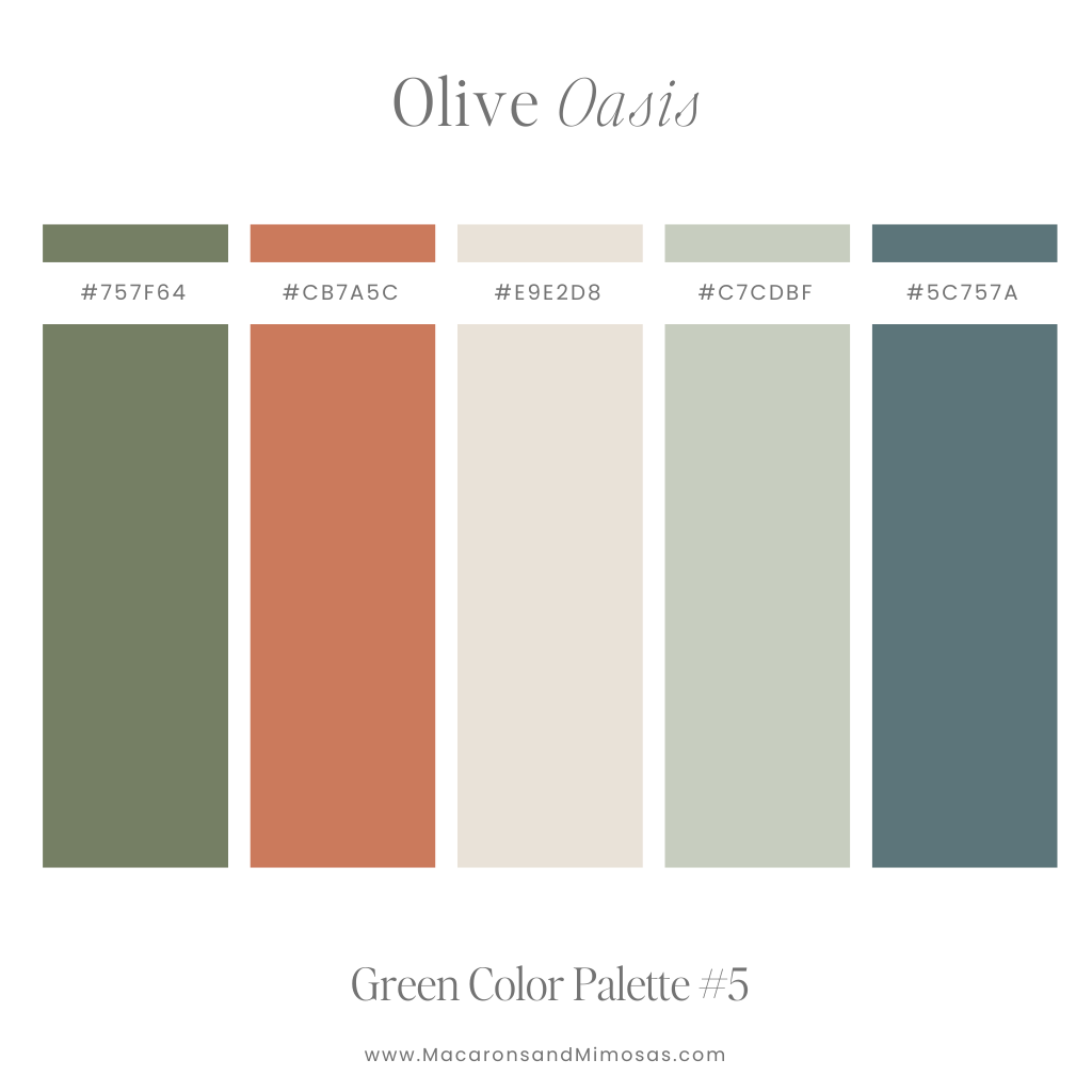
Most interiors rely on nuanced hues that are softened with gray, which makes them easier to live with and more forgiving in varying light. This attention to detail is crucial when **choosing the right palette for your home interior**.
[hostinger-affiliate-table id=”791″]
2. Use Temperature to Tune Mood
**Temperature**—the sense of “warm” versus “cool”—is an essential lever. Warm colors (reds, yellows) feel energizing and intimate, visually advancing; cool colors (blues, greens) feel calming and spacious, often receding and making rooms appear larger. Most successful interiors mix the two: for example, cool walls balanced with warm woods and brass.
Undertones complicate this in useful ways. Noticing undertones helps you avoid clashes—pairing a cool, blue-leaning white with a warm, orange-toned oak floor can make both look off. If uncertain, compare your swatch to a true paper white; the differences jump out.
3. Account for Your Room’s Natural Light
Light changes everything. North-facing rooms often read cooler and flatter, so colors can feel grayer and need warmth or additional saturation to avoid feeling dull. South light is warm and abundant, which can wash out pale colors and turbocharge bright hues; you might need to drop a value (go a bit darker) to retain depth.
Artificial lighting matters too: look for bulbs with a high **CRI (90+)** to render color accurately, and choose a color temperature that matches your intent—2700K for cozy warmth, 3000K–3500K for a balanced feel. This application of **Color Theory in Practice** guarantees accurate results.
4. Apply the 60–30–10 Rule
Use a simple framework like the **60–30–10 rule** to structure your palette: **60% dominant color** (walls or large surfaces), **30% secondary** (furniture, rugs), and **10% accent** (art, pillows, objects). This ratio ensures visual harmony and balance.
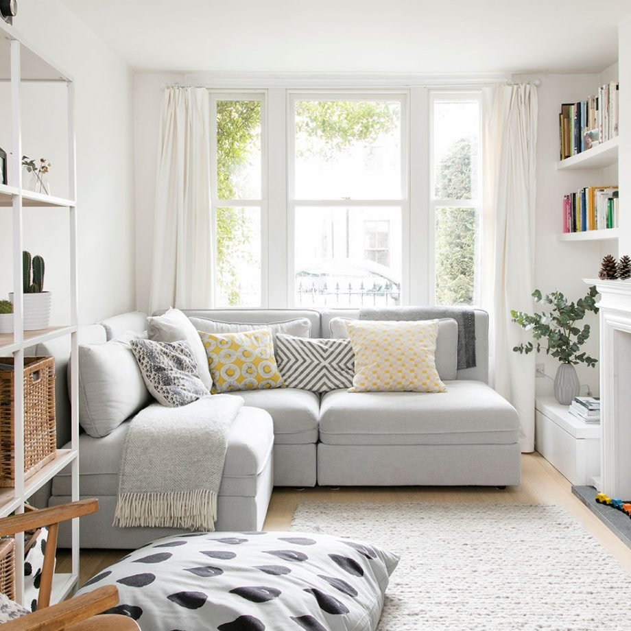
Also consider **Light Reflectance Value (LRV)**, the percentage of light a color reflects; higher LRV bounces light around and can make small rooms airier. Finish also changes perception: matte/flat looks sophisticated, while semi-gloss and gloss highlight architectural trim and make a color read lighter and more intense.
—
Section 2: Choosing Harmonious Palettes Room by Room (Steps 5-8)

5. Establish Flow in Open-Plan Spaces
Start by zooming out. In open-plan spaces, you need an overarching thread—a shared undertone, material, or accent—that links zones without making them identical. A soft warm greige as the main wall color can stretch across living, dining, and kitchen.
Use value shifts (deeper on an accent wall) and texture pivots (oak versus walnut) to create subtle delineation. Keep trim and ceilings consistent throughout to maintain cohesion; a clean, slightly warm white on trim and doors can unify different wall colors.
6. Match Mood to Function (Living, Kitchen, Bedroom)
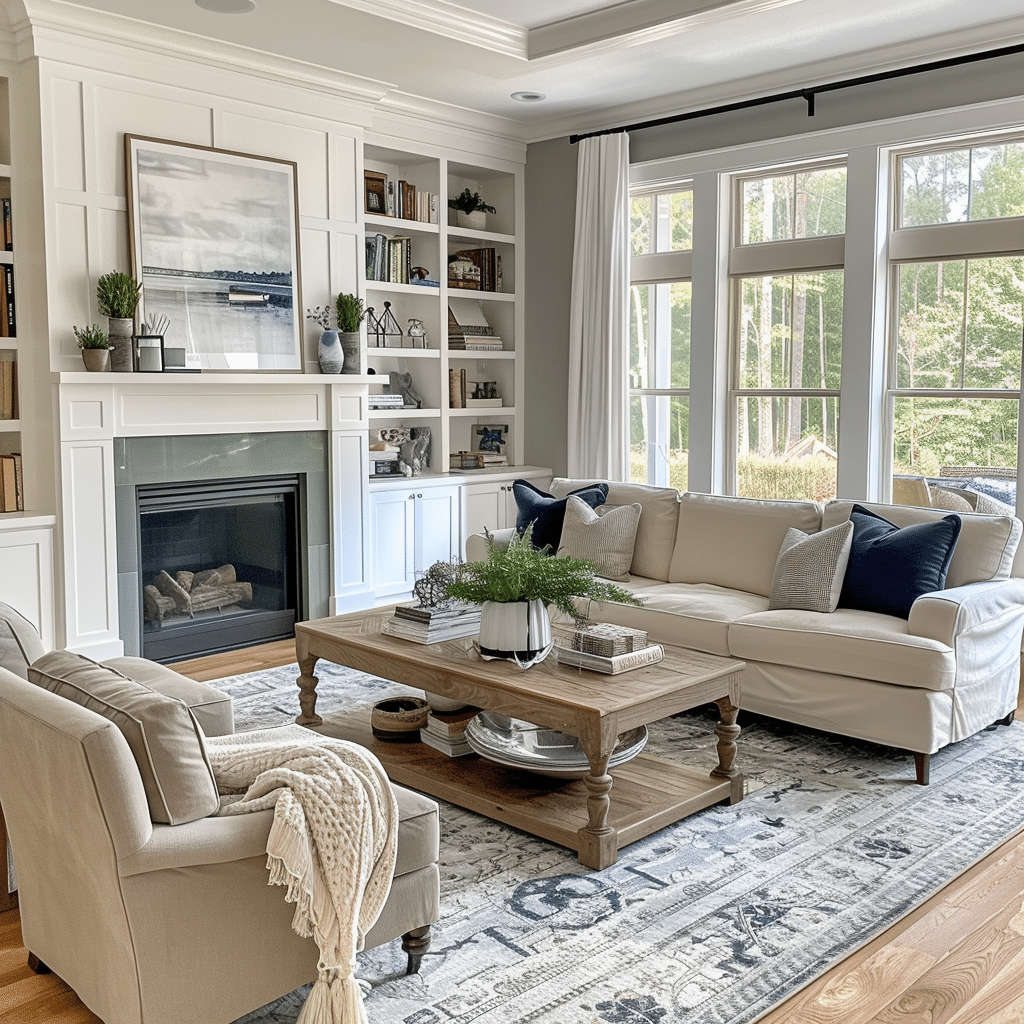
In living rooms, pair a cool wall (dusty blue) with warm elements (caramel leather, brass) to keep the space from feeling chilly. Kitchens must match fixed elements; if your quartz is cool, pick a white with a cool undertone.
Dining rooms tolerate drama: deep teal, aubergine, or inky charcoal make evening meals intimate. Bedrooms call for restorative palettes—gentle greens, blue-grays, or mauve-taupes—kept low in chroma with medium-light values for serenity. This is **Color Theory in Practice** at its best.
7. Use High-Impact, Low-Commitment Areas
Powder rooms invite bold moves; go glossy black, botanical green, or patterned wallpaper without fear—small and self-contained means high impact with minimal commitment. For work zones, mid-tone complex neutrals (greige, mushroom) resist glare on screens and look professional.
Hallways and stairwells connect everything, so choose a light color with a friendly undertone that reflects available light; a gallery of art can supply the color story, letting the walls stay quiet. This ensures a cohesive whole, which is the goal of **choosing the right palette for your home interior**.
8. Test Like a Pro Before Committing
If you’re unsure where to start, use a favorite rug or piece of art as your palette generator: pull one dominant color, one supporting color, and one accent straight from it. Then **test like a pro**—paint sample boards or big swatches directly on the wall in different spots, look at them morning, noon, and night, under your actual bulbs.
If a color looks unexpectedly green or pink at night, that’s metamerism at work; adjust undertone or change bulbs. Finalize sheen by traffic: matte or eggshell in lounges and bedrooms, satin in halls, semi-gloss on trim and doors, moisture-resistant paints in baths and kitchens.
—
Conclusion: A Tool, Not a Gamble
The right palette isn’t a lucky guess—it’s a sequence. Identify fixed elements and light, choose a dominant family and undertone that play nicely with both, pick a harmony (analogous for calm, complementary for energy), tune value and chroma for your room’s scale and sun, and test with real light before you commit.
When you approach **Color Theory in Practice: Choosing the Right Palette for Your Home Interior** this way, you turn paint from a gamble into a tool. The result is a home that feels cohesive without being repetitive, expressive without being chaotic, and—most importantly—uniquely yours.
What’s your biggest challenge when selecting paint: undertones or lighting?


6 thoughts on “Color Theory in Practice: Choosing the Right Palette for Your Home Interior”