10 Interior Design Mistakes That Sabotage Otherwise Lovely Spaces: Scale, Proportion, and Lighting
A picture-perfect home isn’t about buying the most expensive sofa or copying a showroom vignette. **Instead,** it’s about making a series of smart, human-centered choices. The rooms that photograph beautifully and feel great to live in tend to avoid the same repeat offenders: errors of scale, proportion, and lighting.
When these fundamentals fall out of balance, even high-quality pieces can look awkward, and colors you loved in the store suddenly feel flat or off. The good news is that these are solvable problems, often with measuring tape, a few easy rules of thumb, and the right mix of fixtures and bulbs. **Therefore,** knowing these **interior design mistakes** is the first step.
Below, we’ll unpack the 10 **interior design mistakes that most commonly sabotage otherwise lovely spaces**, and show you how to fix them quickly and confidently. We’ll focus on two areas that create the biggest visual payoff: getting scale and proportion right so your rooms feel harmonious, and layering lighting so your home looks nuanced, welcoming, and true to color at every hour.
—
Section 1: Scale and Proportion Errors That Overwhelm Rooms (Mistakes 1-5)

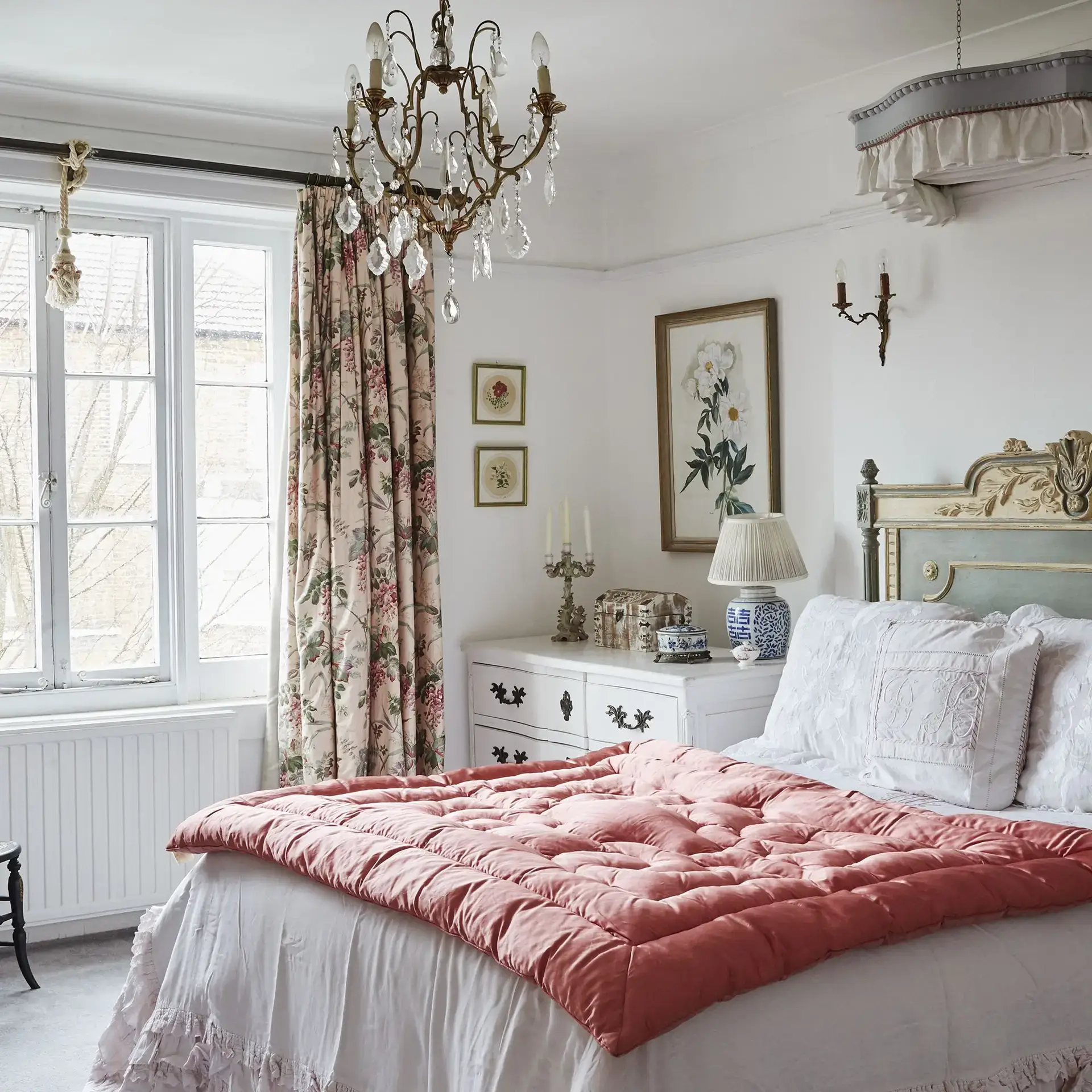
Mistake 1: Choosing Furniture That’s Too Large for the Room
The most common scale blunder is cramming an oversize sectional or hulking armoire into a modest space. Big pieces shrink the perceived volume of a room, choke traffic flow, and force everything else to feel puny by comparison.
**To fix this,** tape out the footprint on the floor and account for clearances; you’ll want about 30–36 inches for main walkways and 14–18 inches between a sofa and coffee table for comfortable reach. If you must have a generous seat, look for visually lighter lines—slim arms, raised legs, and tailored cushions to keep the piece from reading as a block. Avoid this foundational **interior design mistake**.
Mistake 2: Using a “Postage-Stamp” Rug
A rug that floats in the center and touches nothing makes furniture look like it’s stranded and the room feel smaller. This is a common **interior design mistake** regarding anchoring a space.
**The rule of thumb is:** In living rooms, ensure at least the front legs of seating land on the rug. In dining rooms, extend the rug 24 inches beyond the table edge so chairs stay on it when pulled out. In bedrooms, allow 18–24 inches of rug to show on the sides and foot of the bed.
Mistake 3: Pushing All Furniture Against the Walls
While this feels like it creates space, it often has the opposite effect—stretching everything to the perimeter leaves a barren middle and makes conversations feel formal and far away.
**To correct this**, float a sofa or a pair of chairs where possible to establish an inviting island, then anchor with a properly sized rug to define the zone. Use console tables, slender benches, or open-legged pieces behind floating furniture to add function without bulk.
Mistake 4: Ignoring Vertical Proportion
Rooms are three-dimensional volumes; if everything sits low, the eye drops and the ceiling feels lower than it is. This is a frequently overlooked **interior design mistake**.
**To fix this,** hang curtains high—ideally just below the ceiling or crown molding—and long to the floor to accentuate height. Place art so its center sits about 57–60 inches off the floor (gallery standard), and vary heights with tall plants, bookcases, or floor lamps to create an engaging skyline rather than a horizontal lineup.
Mistake 5: Over-Accessorizing with Small Items
Many petite objects read as clutter and visually “buzz” without adding impact. Edit your surfaces and group accents by scale: one large ceramic lamp can be more graceful than two tiny ones; a single substantial vase or a stack of oversized books beats a scatter of trinkets.
**The visual test:** Think in terms of negative space—leave breathing room around key pieces so they can shine. Balance large with medium and small, not small with smaller. For a quick proportion audit, step back and squint: if your eye darts around without landing, you likely need to remove smalls or add a larger anchor.
—
Section 2: Lighting Mistakes That Flatten Mood and Color (Mistakes 6-10)

Mistake 6: Relying on a Single Overhead Fixture
A loner ceiling light casts harsh shadows, emphasizes texture in unflattering ways, and makes corners fall dark. This is the simplest **interior design mistake** to correct for mood.
**Instead,** layer three types of lighting: **ambient** (overall fill), **task** (focused for activities), and **accent** (to highlight art, architecture, or texture). In a living room, combine a ceiling fixture or cove lighting (ambient) with reading lamps or picture lights (task and accent), and add a floor lamp to brighten a dim corner. Layering lets you tune the scene for conversation, TV, chores, or quiet evenings.
Mistake 7: Choosing the Wrong Color Temperature (K) and Poor Color Rendering (CRI)
Bulbs around **2700–3000K** feel warm and flattering for living areas and bedrooms; **3000–3500K** provides a crisp, clean white for kitchens and baths without going sterile. This is a subtle yet crucial **interior design mistake**.
**Crucially,** aim for **90+ CRI** (Color Rendering Index) so your paint, textiles, food, and skin tones read accurately. Low-CRI bulbs make everything look gray or oddly saturated. Consistency matters—mixing 2700K lamps with 4000K recessed can make walls and art appear mismatched. Replace in sets or zones to keep color uniform.
Mistake 8: Skipping Dimmers and Smart Controls
Full brightness all the time flattens mood and wastes energy. This is a functional **interior design mistake** that affects ambiance.
**The simple fix:** Put overheads on dimmers to instantly add depth and softness; use layered lamp scenes you can switch on together to avoid the “cave” effect. Simple, inexpensive dimmers transform rooms more than new décor will, and smart plugs or keypads let you recall lighting presets (dinner, reading, party) with a tap.
Mistake 9: Neglecting Task Lighting at Work Zones
Failure to provide focused light where you need it is both uncomfortable and ineffective. Desks need a focused lamp that illuminates the work plane without glare on screens; kitchen counters crave continuous, diffused under-cabinet strips at the front edge to reduce shadows.
**For bathrooms,** avoid a single downlight over the mirror—it carves unflattering shadows. Use vertical sconces flanking the mirror at eye height for even facial light.
Mistake 10: Blocking or Mismanaging Natural Light
Heavy drapery that stays perpetually closed, dark window film, or reflective flooring/glossy paint that glares at midday all sabotage daylight’s beauty. This is the final **interior design mistake** to avoid.
**To maximize daylight,** soften and spread light with sheers layered under curtains, employ adjustable shades to manage glare, bounce light with satin paint or pale rugs, and consider mirrors opposite windows to carry daylight deeper into the room. For art, aim accent lights at a 30-degree angle to minimize glare and create dimensionality without bleaching color.
—
Conclusion: A Calmer, More Intentional Space
When rooms feel “off,” the culprit is rarely your taste—it’s almost always a breakdown in scale, proportion, or lighting. Avoid the 10 pitfalls above and your home will immediately read as calmer, more intentional, and more photogenic.
Measure before you buy, choose rugs and curtains that anchor and elevate volume, and edit accessories so your largest gestures can breathe. Then, layer light like a cinematographer: warm, dimmable, and coming from multiple directions, with bulbs that flatter color instead of fighting it.
The reward is a home that looks as good as it feels, from morning coffee to late-night conversations—and that stands up beautifully in both everyday life and the camera roll. These **interior design mistakes** are now your design wins.
What’s the biggest design mistake you’ve seen in a home, and how did you fix it? Share your experience below!
One thought on “10 Interior Design Mistakes to Avoid for a Picture-Perfect Home”